Exhibitions aren’t only in museums. Retail spaces, schools, airports, homes, and even public streets and plazas are designed with the intent of displaying graphic information and objects. At Pfau Long, we’ve designed and collaborated on several exhibits at the schools we’ve designed as well as museums, and we continue to look for work and collaborations that allow us to expand our exhibit experience and learn from our colleagues.
When we pursued the opportunity to redesign San Francisco’s Randall Museum—a place that encourages young explorers of science, nature, and the arts—we teamed with Liz Ranieri of Kuth/Ranieri Architects to supplement our understanding of interactive learning spaces for children with Kuth/Ranieri’s deep experience designing art exhibitions.
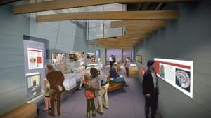
The design process for the Randall Museum has been focused on collaboration, integration, and design for the user experience. As with designing for exhibit work, connecting the user experience to the place, exhibits, and beyond to the larger Bay Area has been the driving concept for the redesign. Daylight and views play a prominent role in the museum through the new lobby skylights and view corridors. The skylights and new large floor opening at the lobby illuminate exhibits in the basement level, forming a spatial connection and allowing the user to examine what is going on below the surface —the geology and oceans exhibits.

In the geology and oceans exhibits, skylights and new large floor opening illuminate exhibits, allowing the user to examine what is going on below the surface.
Views from the main-floor exhibits provide an immediate and constant backdrop to the sweeping terrace and the city beyond. The “tree wall” forms an anchor to the museum as a piece of architecture and art that embraces the fuzzy line between both disciplines. This synergy is something we always strive for in our work.
I recently had a conversation with Liz about designing exhibitions and wanted to share parts of our conversation.
How does your design process change when designing an art gallery versus designing an educational exhibit aimed at kids?
For me, it’s about how work is portrayed. Our 1998 fabrication at SFMoMA, “The Body in Repose,” opened our eyes about the notion of the white wall. Revolving art galleries rely on flexibility and adaptive spaces that can shift with the changes of art in the environment. This requires a balance of architecture that supports the integration of artwork but that is not so fully prescribed that it can’t be adapted in the future.

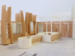
Tree wall
The integration of art and architecture has always been interesting to us. We push the architecture to participate at a higher level. At Randall, this has meant collaborating with the museum staff and animal experts. An abstract tree form is the main feature of the wall enclosure of the animal room—the architectural wall that houses part of the animal collections and interpretive brackets. The tree wall is part of the structure. When art and architecture and exhibit design work together, the result is a richer product.
How do you evaluate art?
Assessing the collection is an important first step—whether the client is a museum, a homeowner, or a developer complying with Section 429 of the planning code, which requires specific projects to provide public artwork on the private property equal to 1% of project costs. The design of the display space is informed by the client’s collection—what are they sharing, what is the meaning of the collection, and who is the audience? We evaluate this with the client to assess what works and what doesn’t.
When working with developers, we try to push beyond the idea of installing a single sculpture in the plaza, and instead move toward creating something immersive and sensory.
We also encourage clients to broaden their intended audience.
How do you develop an exhibit for multiple audiences without diminishing the user experience?
We ask ourselves, “How can we do a better job of elevating discourse?” In the case of the Randall, more interactive art can enrich all kinds of systems. Our age-two-to-17 audience’s interests range from simplistic to educational. How do we expand on the client’s collection and stage education that will be age appropriate?
We are interested in pushing architecture to participate at a higher level, and we’ve crafted this in close collaboration with museum staff and animal experts. A two-year old child will be excited by the animals and the tree wall enclosure of the animal room. A middle-school student can use the space as a research tool, collecting facts from signage, observing the animals, and talking directly with the docents and the scientists that work there. And a high school student can go deeper and learn about animal rights activism.
Albert Einstein once said, “Look deep into nature, and then you will understand everything better.” His words have been a guide for us on this project—actually on many projects.
I think Liz captured the spirit of this project perfectly. In nature, everything is connected. The idea of this connection has rooted the building to directly support the exhibit design and the content of the collection itself. I can’t wait for you to come visit.
